The details element
- Categories:
- Flow content.
- Sectioning root.
- Interactive content.
- Palpable content.
- Contexts in which this element can be used:
- Where flow content is expected.
- Content model:
- One
summary element followed by flow content. - Tag omission in text/html:
- Neither tag is omissible.
- Content attributes:
- Global attributes
open — Whether the details are visible- Allowed ARIA role attribute values:
- Any role that supports
aria-expanded. - Allowed ARIA State and Property Attributes:
- Global aria-* attributes
- Any
aria-* attributes
applicable to the allowed roles. - DOM interface:
-
interface HTMLDetailsElement : HTMLElement {
  attribute boolean open;
};
The details element represents a disclosure widget from which the
user can obtain additional information or controls.
The details element is not appropriate for footnotes. Please see the section on footnotes for details on how to mark up footnotes.
The first summary element child of the element, if any,
represents the summary or legend of the details. If there is no
child summary element, the user agent should provide its own legend (e.g.
"Details").
The rest of the element's contents represents the additional information or
controls.
The open content attribute is a boolean
attribute. If present, it indicates that both the summary and the additional information is
to be shown to the user. If the attribute is absent, only the summary is to be shown.
When the element is created, if the attribute is absent, the additional information should be
hidden; if the attribute is present, that information should be shown. Subsequently, if the
attribute is removed, then the information should be hidden; if the attribute is added, the
information should be shown.
The user agent should allow the user to request that the additional information be shown or
hidden. To honor a request for the details to be shown, the user agent must set the open attribute on the element to the value open. To honor a request for the information to be hidden, the user agent must
remove the open attribute from the element.
Whenever the open attribute is added to or removed from
a details element, the user agent must queue a task that runs the
following steps, which are known as the details notification task steps, for this
details element:
-
If another task has been queued to run the details notification task steps for this
details element, then abort these steps.
When the open attribute is toggled
several times in succession, these steps essentially get coalesced so that only one event is
fired.
Fire a simple event named toggle at the
details element.
The task source for this task must be the DOM manipulation task
source.
The open IDL attribute must
reflect the open content attribute.
The following example shows the details element being used to hide technical
details in a progress report.
<section class="progress window">
 <h1>Copying "Really Achieving Your Childhood Dreams"</h1>
 <details>
  <summary>Copying... <progress max="375505392" value="97543282"></progress> 25%</summary>
  <dl>
   <dt>Transfer rate:</dt> <dd>452KB/s</dd>
   <dt>Local filename:</dt> <dd>/home/rpausch/raycd.m4v</dd>
   <dt>Remote filename:</dt> <dd>/var/www/lectures/raycd.m4v</dd>
   <dt>Duration:</dt> <dd>01:16:27</dd>
   <dt>Colour profile:</dt> <dd>SD (6-1-6)</dd>
   <dt>Dimensions:</dt> <dd>320×240</dd>
  </dl>
 </details>
</section>
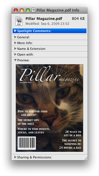
The following shows how a details element can be used to hide some controls by
default:
<details>
 <summary><label for=fn>Name & Extension:</label></summary>
 <p><input type=text id=fn name=fn value="Pillar Magazine.pdf">
 <p><label><input type=checkbox name=ext checked> Hide extension</label>
</details>
One could use this in conjunction with other details in a list to allow the user
to collapse a set of fields down to a small set of headings, with the ability to open each
one.
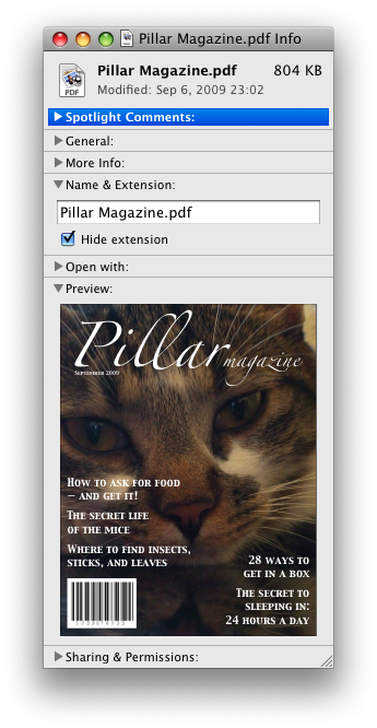
In these examples, the summary really just summarises what the controls can change, and not
the actual values, which is less than ideal.
Because the open attribute is added and removed
automatically as the user interacts with the control, it can be used in CSS to style the element
differently based on its state. Here, a stylesheet is used to animate the colour of the summary
when the element is opened or closed:
<style>
 details > summary { transition: color 1s; color: black; }
 details[open] > summary { color: red; }
</style>
<details>
 <summary>Automated Status: Operational</summary>
 <p>Velocity: 12m/s</p>
 <p>Direction: North</p>
</details>
The element
- :
- .
- If the element's attribute is in the state: .
- :
- Where is expected.
- If the element's attribute is in the state: as the child of a element whose attribute is in the state.
- :
- If the element's attribute is in the state: either zero or more and elements, or, .
- If the element's attribute is in the state: in any order, zero or more elements, zero or more elements, zero or more elements whose attributes are in the state, and zero or more elements.
- :
- Neither tag is omissible.
- :
- — Type of menu
- — User-visible label
- Allowed ARIA role attribute values:
menu
(default - do not set),
directory,
list,
listbox,
menubar,
tablist,
tabpanel
or tree.- Allowed ARIA State and Property Attributes:
- Global aria-* attributes
- Any
aria-* attributes
applicable to the allowed roles. - :
-
interface : {
attribute DOMString ;
attribute DOMString ;
// also has obsolete members
};
The element represents a list of commands.
The attribute is an indicating the kind of menu being declared. The attribute has two states. The
"" keyword maps to the state, in which the element is declaring a context menu
or the menu for a . The "" keyword maps to the toolbar state, in which the element is declaring a toolbar. The attribute may also be
omitted. The is the
state if the parent element is a element whose attribute is in the state; otherwise, it is the state.
If a element's attribute is in the
state, then the element
the commands of a popup menu, and the user can only examine and interact with the commands if that
popup menu is activated through some other element, either via the attribute or the element's attribute.
If a element's attribute is in the
state, then the element a
toolbar consisting of its contents, in the form of either an unordered list of items (represented
by elements), each of which represents a command that the user can perform or
activate, or, if the element has no element children,
describing available commands.
The attribute gives the label of the
menu. It is used by user agents to display nested menus in the UI: a context menu containing
another menu would use the nested menu's attribute for
the submenu's menu label. The attribute must only be
specified on elements whose parent element is a element whose
attribute is in the state.
A is a if it is the
child of a , or if it is the
of a element that is not
, does not have a attribute, and is not
the descendant of an element with a attribute.
A consists of an ordered list of zero or more , which can be any of:
- Commands, which can be marked as default commands ()
- Separators ()
- Other , each with an associated , which allows the list to be nested ()
To build and show a menu for a particular element
source and with a particular element subject as a subject, the user agent
must run the following steps:
Let pop-up menu be the created by the algorithm when passed the source element.
-
Display pop-up menu to the user, and let the algorithm that invoked this one continue.
If the user selects a that corresponds to an element that still represents a command when the user selects it, then the UA must invoke that
command's Action. If the command's Action is defined as , either directly or via the algorithm, then the attribute of that event must be initialised to subject.
Pop-up menus must not, while being shown, reflect changes in the DOM. The menu is constructed
from the DOM before being shown, and is then immutable.
To for an element source, the user agent must run
the following steps, which return a :
Let generated menu be an empty .
-
Run the steps for the element using generated menu
as the output.
The steps for a element using a specific output as
output are as follows: For each child node of the in ,
run the appropriate steps from the following list:
- If the child is a element that defines
a command
- Append the command to output, respecting the command's . If the element has a attribute, mark the command as being a default
command.
- If the child is an element
- Append a to output.
- If the child is a element with no attribute
- Append a to output, then run
the steps for this child element, using
output as the output, then append another to output.
- If the child is a element with a attribute
- Let submenu be the result of running the steps for the child element. Then, append submenu to output, using the value of the child
element's attribute as the .
- Otherwise
- the child node.
Remove from output any whose is the empty string.
Remove from output any representing a command whose Label is
the empty string.
Collapse all sequences of two or more adjacent in output to a single .
If the first in output is a , then remove it.
If the last in output is a , then remove it.
Return output.
The IDL attribute must
the content attribute of the same name, .
The IDL attribute must
the content attribute of the same name.
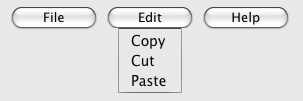
In this example, the element is used to describe a toolbar with three menu
buttons on it, each of which has a dropdown menu with a series of options:
<menu>
 <li>
  <button type=menu value="File" menu="filemenu">
  <menu id="filemenu" type="popup">
   <menuitem onclick="fnew()" label="New...">
   <menuitem onclick="fopen()" label="Open...">
   <menuitem onclick="fsave()" label="Save">
   <menuitem onclick="fsaveas()" label="Save as...">
  </menu>
 </li>
 <li>
  <button type=menu value="Edit" menu="editmenu">
  <menu id="editmenu" type="popup">
   <menuitem onclick="ecopy()" label="Copy">
   <menuitem onclick="ecut()" label="Cut">
   <menuitem onclick="epaste()" label="Paste">
  </menu>
 </li>
 <li>
  <button type=menu value="Help" menu="helpmenu">
  <menu id="helpmenu" type="popup">
   <menuitem onclick="location='help.html'" label="Help">
   <menuitem onclick="location='about.html'" label="About">
  </menu>
 </li>
</menu>
In a supporting user agent, this might look like this (assuming the user has just activated the
second button):
The menuitem element
- :
- None.
- :
- As a child of a element whose attribute is in the state.
- :
- .
- :
- No .
- :
- — Type of command
- — User-visible label
- — Icon for the command
- — Whether the form control is disabled
- — Whether the command or control is checked
- — Name of group of commands to treat as a radio button group
- — Mark the command as being a default command
command — Command definition- Also, the attribute on this element: Hint describing the command.
- Allowed ARIA role attribute values:
menuitem
(default - do not set).- Allowed ARIA State and Property Attributes:
- Global aria-* attributes
- Any
aria-* attributes
applicable to the allowed roles. - :
-
interface : {
attribute DOMString ;
attribute DOMString ;
attribute DOMString ;
attribute boolean ;
attribute boolean ;
attribute DOMString ;
attribute boolean ;
readonly attribute ? command;
};
The element represents a command that the user can invoke from a popup
menu (either a or the menu of a ).
A element that uses one or more of the
,
,
,
,
, and
attributes defines a new command.
A element that uses the command attribute defines a command by reference to another
one. This allows authors to define a command once, and set its state (e.g. whether it is active or
disabled) in one place, and have all references to that command in the user interface change at
the same time.
If the command attribute is specified, the element
is in the indirect command mode. If it is not specified, it is in the explicit
command mode. When the element is in the indirect command mode, the element
must not have any of the following attributes specified:
,
,
,
,
,
.
The attribute indicates the kind of
command: either a normal command with an associated action, or a state or option that can be
toggled, or a selection of one item from a list of items.
The attribute is an with three keywords and states. The
"command" keyword maps to the
Command state, the "" keyword maps to the state, and the "" keyword maps to the state. The is the Command state.
- The Command state
The element a normal command with an associated action.
- The state
The element a state or option that can be toggled.
- The state
The element a selection of one item from a list of items.
The attribute gives the name of the
command, as shown to the user. The attribute must
be specified if the element is in the explicit command mode. If the attribute is
specified, it must have a value that is not the empty string.
The attribute gives a picture that
represents the command. If the attribute is specified, the attribute's value must contain a
. To obtain
the of the icon when the attribute's value is not the empty string, the
attribute's value must be relative to the element.
When the attribute is absent, or its value is the empty string, or its value fails, there is no icon.
The attribute is a
that, if present, indicates that the command is not available in
the current state.
The distinction between and
is subtle. A command would be disabled if, in the same
context, it could be enabled if only certain aspects of the situation were changed. A command
would be marked as hidden if, in that situation, the command will never be enabled. For example,
in the context menu for a water faucet, the command "open" might be disabled if the faucet is
already open, but the command "eat" would be marked hidden since the faucet could never be
eaten.
The attribute is a that, if present, indicates that the command is selected. The attribute must be
omitted unless the attribute is in either the state or the state.
The attribute gives the
name of the group of commands that will be toggled when the command itself is toggled, for
commands whose attribute has the value "radio". The scope of the name is the child list of the parent element. The
attribute must be omitted unless the attribute is in
the state. When specified, the
attribute's value must be a non-empty string.
If a element slave has a command attribute, and there is an element in
slave's whose has
a value equal to the value of slave's command attribute, and the first such element in , hereafter master, itself defines a
command and either is not a element or does not itself have a command attribute, then the master command of slave is master.
A element with a command
attribute must have a master command.
This effectively defines the syntax of the attribute's value as being the ID of
another element that defines a command.
The attribute gives a hint describing
the command, which might be shown to the user to help him.
The attribute indicates, if
present, that the command is the one that would have been invoked if the user had directly
activated the menu's subject instead of using the menu. The attribute is a .
In this trivial example, a submit button is given a context menu that has two options, one to
reset the form, and one to submit the form. The submit command is marked as being the default.
<form action="dosearch.pl">
 <p><label>Enter search terms: <input type="text" name="terms"></label></p>
 <p><input type=submit contextmenu=formmenu id="submitbutton"></p>
 <p hidden><input type=reset id="resetbutton"></p>
 <menu type=popup id=formmenu>
  <menuitem command="submitbutton" default>
  <menuitem command="resetbutton">
 </menu>
</form>
The IDL attribute must
the content attribute of the same name, .
The , , , , and , and IDL attributes must
the respective content attributes of the same name.
The command IDL attribute must return the
master command, if any, or null otherwise.
If the element's Disabled State is false
(enabled) then the element's depends on the element's and command
attributes, as follows:
- If the element has a master command set by its
command attribute The user agent must on the element's
master command.
- If the attribute is in the state
If the element has a attribute, the UA
must remove that attribute. Otherwise, the UA must add a attribute, with the literal value "checked".
- If the attribute is in the state
If the element has a parent, then the UA must walk the list of child nodes of that parent
element, and for each node that is a element, if that element has a attribute whose value exactly matches the
current element's (treating missing
attributes as if they were the empty string), and has a attribute, must remove that attribute.
Then, the element's attribute must be set
to the literal value "checked".
- Otherwise
The element's is to do nothing.
Firing a synthetic event at the element
does not cause any of the actions described above to happen.
If the element's Disabled State is true
(disabled) then the element has no .
The element is not rendered except as .
Here is an example of a pop-up menu button with three options that let the user toggle between
left, center, and right alignment. One could imagine such a toolbar as part of a text editor. The
menu also has a separator followed by another menu item labeled "Publish", though that menu item
is disabled.
<button type=menu menu=editmenu>Commands...</button>
<menu type="popup" id="editmenu">
 <menuitem type="radio" radiogroup="alignment" checked="checked"
          label="Left" icon="icons/alL.png" onclick="setAlign('left')">
 <menuitem type="radio" radiogroup="alignment"
          label="Center" icon="icons/alC.png" onclick="setAlign('center')">
 <menuitem type="radio" radiogroup="alignment"
          label="Right" icon="icons/alR.png" onclick="setAlign('right')">
 <hr>
 <menuitem type="command" disabled
          label="Publish" icon="icons/pub.png" onclick="publish()">
</menu>
Context menus
Declaring a context menu
The attribute gives the element's
context menu. The value must be the of a
element in the same whose
attribute is in the state.
When a user right-clicks on an element with a attribute, the user agent will first fire a event at the element, and then, if that event is not
canceled, a event at the element.
Here is an example of a context menu for an input control:
<form name="npc">
 <label>Character name: <input name=char type=text contextmenu=namemenu required></label>
 <menu type=popup id=namemenu>
  <menuitem label="Pick random name" onclick="document.forms.npc.elements.char.value = getRandomName()">
  <menuitem label="Prefill other fields based on name" onclick="prefillFields(document.forms.npc.elements.char.value)">
 </menu>
</form>
This adds two items to the control's context menu, one called "Pick random name", and one
called "Prefill other fields based on name". They invoke scripts that are not shown in the
example above.
Processing model
Each element has an , which can be null. If an element A has a attribute, and there is
an element with the ID given by A's attribute's value in A's
home subtree, and the first such element in tree order is a
element whose attribute is in the state, then A's is that element. Otherwise, if A has a parent element,
then A's is the of its parent element. Otherwise, A's is null.
When an element's context menu is requested (e.g. by the user right-clicking the element, or
pressing a context menu key), the user agent must apply the appropriate rules from the following
list:
- If the user requested a context menu using a pointing device
The user agent must fire a trusted event with the name , that bubbles and is cancelable, and that uses the
MouseEvent interface, at the element for which the menu was requested. The context
information of the event must be initialised to the same values as the last
MouseEvent user interaction event that was fired as part of the gesture that was
interpreted as a request for the context menu.
- Otherwise
The user agent must fire a synthetic mouse
event named contextmenu that bubbles and is
cancelable at the element for which the menu was requested.
Typically, therefore, the firing of the event will be the default action of a mouseup or keyup event. The exact
sequence of events is UA-dependent, as it will vary based on platform conventions.
The default action of the event depends on
whether or not the element for which the menu was requested has a non-null when the event dispatch has completed, as follows.
If the of the element for which the menu was requested is
null, the default action must be for the user agent to show its default context menu, if it has
one.
Otherwise, let subject be the element for which the menu was requested, and let
menu be the of target immediately after
the event's dispatch has completed. The user
agent must fire a trusted event with the name show at menu, using the RelatedEvent interface,
with the relatedTarget attribute initialised
to subject. The event must be cancelable.
If this event (the show event) is not canceled, then
the user agent must build and show the menu for
menu with subject as the subject.
The user agent may also provide access to its default context menu, if any, with the context
menu shown. For example, it could merge the menu items from the two menus together, or provide the
page's context menu as a submenu of the default menu. In general, user agents are encouraged to
de-emphasise their own contextual menu items, so as to give the author's context menu the
appearance of legitimacy — to allow documents to feel like "applications" rather than "mere
Web pages".
User agents may provide means for bypassing the context menu processing model, ensuring that
the user can always access the UA's default context menus. For example, the user agent could
handle right-clicks that have the Shift key depressed in such a way that it does not fire the
event and instead always shows the default
context menu.
The IDL attribute must
reflect the content attribute.
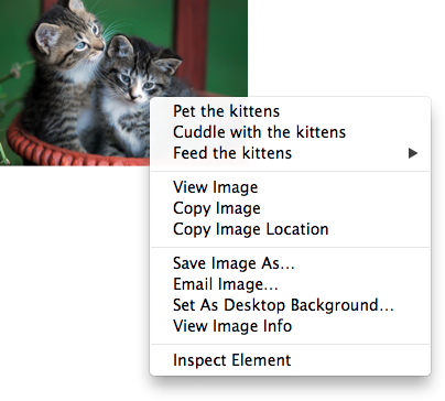
In this example, an image of cats is given a context menu with four possible commands:
<img src="cats.jpeg" alt="Cats" contextmenu=catsmenu>
<menu type="popup" id="catsmenu">
 <menuitem label="Pet the kittens" onclick="kittens.pet()">
 <menuitem label="Cuddle with the kittens" onclick="kittens.cuddle()">
 <menu label="Feed the kittens">
  <menuitem label="Fish" onclick="kittens.feed(fish)">
  <menuitem label="Chicken" onclick="kittens.feed(chicken)">
 </menu>
</menu>
When a user of a mouse-operated visual Web browser right-clicks on the image, the browser
might pop up a context menu like this:
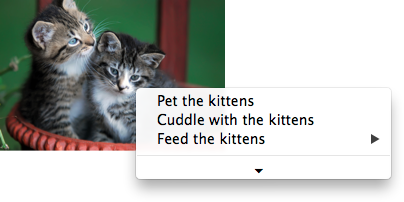
When the user clicks the disclosure triangle, such a user agent would expand the context menu
in place, to show the browser's own commands:
[Constructor(DOMString type, optional RelatedEventInit eventInitDict)]
interface RelatedEvent : Event {
  readonly attribute EventTarget? relatedTarget;
};

dictionary RelatedEventInit : EventInit {
  EventTarget? relatedTarget;
};
- event .
relatedTarget -
Returns the other event target involved in this event. For example, when a show event fires on a element, the other event
target involved in the event would be the element for which the menu is being shown.
The relatedTarget attribute must
return the value it was initialised to. When the object is created, this attribute must be
initialised to null. It represents the other event target that is related to the event.
Commands
Facets
A command is the abstraction behind menu items, buttons, and
links. Once a command is defined, other parts of the interface can refer to the same command,
allowing many access points to a single feature to share facets such as the Disabled State.
Commands are defined to have the following facets:
- Type
- The kind of command: "command", meaning it is a normal command; "radio", meaning that
triggering the command will, amongst other things, set the Checked State to true (and probably uncheck some other
commands); or "checkbox", meaning that triggering the command will, amongst other things, toggle
the value of the Checked State.
- ID
- The name of the command, for referring to the command from the markup or from script. If a
command has no ID, it is an anonymous command.
- Label
- The name of the command as seen by the user.
- Hint
- A helpful or descriptive string that can be shown to the user.
- Icon
- An absolute URL identifying a graphical image that represents the action. A
command might not have an Icon.
- Access Key
- A key combination selected by the user agent that triggers the command. A command might not
have an Access Key.
- Hidden State
- Whether the command is hidden or not (basically, whether it should be shown in menus).
- Disabled State
- Whether the command is relevant and can be triggered or not.
- Checked State
- Whether the command is checked or not.
- Action
- The actual effect that triggering the command will have. This could be a scripted event
handler, a URL to which to navigate, or a form submission.
These facets are exposed on elements using the command API:
- element .
commandType -
Exposes the Type facet of the command.
- element .
id -
Exposes the ID facet of the command.
- element .
commandLabel -
Exposes the Label facet of the command.
- element .
title -
Exposes the Hint facet of the command.
- element .
commandIcon -
Exposes the Icon facet of the command.
- element .
accessKeyLabel -
Exposes the Access Key facet of the command.
- element .
commandHidden -
Exposes the Hidden State facet of the command.
- element .
commandDisabled -
Exposes the Disabled State facet of the command.
- element .
commandChecked -
Exposes the Checked State facet of the command.
- element .
click() -
Triggers the Action of the command.
The commandType attribute must
return a string whose value is either "command", "radio", or "checkbox", depending on whether the Type of the command defined by the element is "command",
"radio", or "checkbox" respectively. If the element does not define a command, it must return
null.
The commandLabel attribute must
return the command's Label, or null if the element does
not define a command or does not specify a Label.
The commandIcon attribute must
return the absolute URL of the command's Icon. If the element does not specify an icon, or if the element
does not define a command, then the attribute must return null.
The commandHidden attribute must
return true if the command's Hidden State is that
the command is hidden, and false if the command is not hidden. If the element does not define a
command, the attribute must return null.
The commandDisabled attribute
must return true if the command's Disabled State
is that the command is disabled, and false if the command is not disabled. This attribute is not
affected by the command's Hidden State. If the
element does not define a command, the attribute must return null.
The commandChecked attribute must
return true if the command's Checked State is that
the command is checked, and false if it is that the command is not checked. If the element does
not define a command, the attribute must return null.
The ID facet is exposed by the id IDL attribute, the Hint
facet is exposed by the title IDL attribute, and the AccessKey facet is exposed by the accessKeyLabel IDL attribute.
- document .
commands -
Returns an HTMLCollection of the elements in the Document that
define commands and have IDs.
The commands attribute of the document's
Document interface must return an HTMLCollection rooted at the
Document node, whose filter matches only elements that define commands and have IDs.
User agents may expose the commands that match the following criteria:
User agents are encouraged to do this especially for commands that have Access Keys, as a way to advertise those keys to the
user.
For example, such commands could be listed in the user agent's menu bar.
Using the a element to define a command
An a element with an href attribute defines a command.
The Type of the command is "command".
The ID of the command is the value of the id attribute of the element, if the attribute is present and not empty.
Otherwise the command is an anonymous command.
The Label of the command is the string given by the
element's textContent IDL attribute.
The Hint of the command is the value of the title attribute of the element. If the attribute is not present, the
Hint is the empty string.
The Icon of the command is the absolute
URL obtained from resolving the value of the src attribute of the first img element descendant of the
element in tree order, relative to that element, if there is such an element and
resolving its attribute is successful. Otherwise, there is no Icon for the command.
The AccessKey of the command is the element's
assigned access key, if any.
The Hidden State of the command is true (hidden)
if the element has a hidden attribute, and false otherwise.
The Disabled State facet of the command is
true if the element or one of its ancestors is inert, and false otherwise.
The Checked State of the command is always
false. (The command is never checked.)
The Action of the command, if the element has a
defined activation behaviour, is to run synthetic click activation steps
on the element. Otherwise, it is just to fire a click
event at the element.
Using the button element to define a command
A button element always defines a
command.
The Type, ID,
Label, Hint,
Icon, Access
Key, Hidden State, Checked State, and Action facets of the command are determined as for a elements (see the previous section).
The Disabled State of the command is true if
the element or one of its ancestors is inert, or if the element's disabled state is set, and false otherwise.
Using the input element to define a command
An input element whose type attribute is in
one of the Submit Button, Reset Button, Image
Button, Button, Radio Button, or Checkbox states defines a
command.
The Type of the command is "radio" if the type attribute is in the Radio
Button state, "checkbox" if the type attribute is in
the Checkbox state, and "command" otherwise.
The ID of the command is the value of the id attribute of the element, if the attribute is present and not empty.
Otherwise the command is an anonymous command.
The Label of the command depends on the Type of the
command:
If the Type is "command", then it is the string given
by the value attribute, if any, and a UA-dependent,
locale-dependent value that the UA uses to label the button itself if the attribute is absent.
Otherwise, the Type is "radio" or "checkbox". If the
element is a labeled control, the textContent of the first
label element in tree order whose labeled control is the
element in question is the Label (in DOM terms, this is
the string given by element.labels[0].textContent). Otherwise,
the value of the value attribute, if present, is the Label. Otherwise, the Label is the empty string.
The Hint of the command is the value of the title attribute of the input element. If the attribute is
not present, the Hint is the empty string.
If the element's type attribute is in the Image Button state, and the element has a src attribute, and that attribute's value can be successfully resolved relative to the element, then the Icon of the command is the absolute URL obtained
from resolving that attribute that way. Otherwise, there is no Icon for the command.
The AccessKey of the command is the element's
assigned access key, if any.
The Hidden State of the command is true (hidden)
if the element has a hidden attribute, and false otherwise.
The Disabled State of the command is true if
the element or one of its ancestors is inert, or if the element's disabled state is set, and false otherwise.
The Checked State of the command is true if the
command is of Type "radio" or "checkbox" and the element
is checked attribute, and false otherwise.
The Action of the command, if the element has a
defined activation behaviour, is to run synthetic click activation steps
on the element. Otherwise, it is just to fire a click
event at the element.
Using the option element to define a command
An option element with an ancestor select element and either no value attribute or a value
attribute that is not the empty string defines a command.
The Type of the command is "radio" if the
option's nearest ancestor select element has no multiple attribute, and "checkbox" if it does.
The ID of the command is the value of the id attribute of the element, if the attribute is present and not empty.
Otherwise the command is an anonymous command.
The Label of the command is the value of the
option element's label attribute, if there is
one, or else the value of option element's textContent IDL attribute,
with leading and trailing whitespace
stripped, and with any sequences of two or more space
characters replaced by a single U+0020 SPACE character.
The Hint of the command is the string given by the
element's title attribute, if any, and the empty string if the
attribute is absent.
There is no Icon for the command.
The AccessKey of the command is the element's
assigned access key, if any.
The Hidden State of the command is true (hidden)
if the element has a hidden attribute, and false otherwise.
The Disabled State of the command is true if
the element is disabled, or if its nearest ancestor
select element is disabled, or if it or one
of its ancestors is inert, and false otherwise.
The Checked State of the command is true
(checked) if the element's selectedness is true,
and false otherwise.
The Action of the command depends on its Type. If the command is of Type "radio" then it must pick the option element. Otherwise, it must toggle the option element.
Using the menuitem element to define a
command
A menuitem element that does not have a command attribute defines a
command.
The Type of the command is "radio" if the
menuitem's type attribute is "radio", "checkbox" if the attribute's value is
"checkbox", and "command" otherwise.
The ID of the command is the value of the id attribute of the element, if the attribute is present and not empty.
Otherwise the command is an anonymous command.
The Label of the command is the value of the element's
label attribute, if there is one, or the empty string if
it doesn't.
The Hint of the command is the string given by the
element's title attribute, if any, and the empty string
if the attribute is absent.
The Icon for the command is the absolute
URL obtained from resolving the value of the element's
icon attribute, relative to the element, if it has such an
attribute and resolving it is successful. Otherwise, there is no Icon for the command.
The AccessKey of the command is the element's
assigned access key, if any.
The Hidden State of the command is true (hidden)
if the element has a hidden attribute, and false otherwise.
The Disabled State of the command is true if
the element or one of its ancestors is inert, or if the element has a disabled attribute, and false otherwise.
The Checked State of the command is true
(checked) if the element has a checked attribute, and
false otherwise.
The Action of the command, if the element has a
defined activation behaviour, is to
run synthetic click activation steps on the element. Otherwise, it is just to
fire a click event at the element.
Using the accesskey
attribute to define a command on other elements
An element that has an assigned access key defines a
command.
If one of the earlier sections that define elements that define
commands define that this element defines a command,
then that section applies to this element, and this section does not. Otherwise, this section
applies to that element.
The Type of the command is "command".
The ID of the command is the value of the id attribute of the element, if the attribute is present and not empty.
Otherwise the command is an anonymous command.
The Label of the command depends on the element. If
the element is a labeled control, the textContent of the first
label element in tree order whose labeled control is the
element in question is the Label (in DOM terms, this is
the string given by element.labels[0].textContent). Otherwise,
the Label is the textContent of the element
itself.
The Hint of the command is the value of the title attribute of the element. If the attribute is not present, the
Hint is the empty string.
There is no Icon for the command.
The AccessKey of the command is the element's
assigned access key.
The Hidden State of the command is true (hidden)
if the element has a hidden attribute, and false otherwise.
The Disabled State of the command is true if
the element or one of its ancestors is inert, and false otherwise.
The Checked State of the command is always
false. (The command is never checked.)
The Action of the command is to run the following
steps:
- Run the focusing steps for the element.
- If the element has a defined activation behaviour, run synthetic click
activation steps on the element.
- Otherwise, if the element does not have a defined activation behaviour,
fire a
click event at the element.
The dialog element
- Categories:
- Flow content.
- Sectioning root.
- Contexts in which this element can be used:
- Where flow content is expected.
- Content model:
- Flow content.
- Tag omission in text/html:
- Neither tag is omissible.
- Content attributes:
- Global attributes
open — Whether the dialog box is showing- Allowed ARIA role attribute values:
dialog
(default - do not set),
alert,
alertdialog,
application,
log,
marquee
or status.- Allowed ARIA State and Property Attributes:
- Global aria-* attributes
- Any
aria-* attributes
applicable to the allowed roles. - DOM interface:
-
interface HTMLDialogElement : HTMLElement {
  attribute boolean open;
  attribute DOMString returnValue;
  void show(optional (MouseEvent or Element) anchor);
  void showModal(optional (MouseEvent or Element) anchor);
  void close(optional DOMString returnValue);
};
The dialog element represents a part of an application that a user interacts with
to perform a task, for example a dialog box, inspector, or window.
The open attribute is a boolean
attribute. When specified, it indicates that the dialog element is active and
that the user can interact with it.
A dialog element without an open attribute
specified should not be shown to the user. This requirement may be implemented indirectly through
the style layer. For example, user agents that support the suggested
default rendering implement this requirement using the CSS rules described in the rendering section.
The tabindex attribute must not be specified on
dialog elements.
- dialog .
show( [ anchor ] ) -
Displays the dialog element.
The argument, if provided, provides an anchor point to which the element will be fixed.
- dialog .
showModal( [ anchor ] ) -
Displays the dialog element and makes it the top-most modal dialog.
The argument, if provided, provides an anchor point to which the element will be fixed.
This method honors the autofocus attribute.
- dialog .
close( [ result ] ) -
Closes the dialog element.
The argument, if provided, provides a return value.
- dialog .
returnValue [ = result ] -
Returns the dialog's return value.
Can be set, to update the return value.
When the show() method is invoked, the user
agent must run the following steps:
If the element already has an open attribute, then
abort these steps.
Add an open attribute to the dialog
element, whose value is the empty string.
If the show() method was invoked with an argument,
set up the position of the dialog element, using that argument as the
anchor. Otherwise, set the dialog to the normal alignment mode.
Run the dialog focusing steps for the dialog element.
Each Document has a stack of dialog elements known as the
pending dialog stack. When a Document is created, this stack must be
initialised to be empty.
When an element is added to the pending dialog stack, it must also be added to the
top layer layer. When an element is removed from the pending dialog
stack, it must be removed from the top layer. [[!FULLSCREEN]]
When the showModal() method is invoked,
the user agent must run the following steps:
Let subject be the dialog element on which the method was
invoked.
If subject already has an open
attribute, then throw an InvalidStateError exception and abort these steps.
If subject is not in a Document, then throw
an InvalidStateError exception and abort these steps.
Add an open attribute to subject, whose value is the empty string.
If the showModal() method was invoked with an
argument, set up the position of subject, using that argument
as the anchor. Otherwise, set the dialog to the centered alignment
mode.
Let subject's node document be blocked by the modal dialog subject.
Push subject onto subject's
node document's pending dialog stack.
Run the dialog focusing steps for subject.
The dialog focusing steps for a dialog element subject are as follows:
If for some reason subject is not a control group owner
at this point, or if it is inert, abort these steps.
-
Let control be the first non-inert focusable area in
subject's control group whose DOM anchor has an autofocus attribute specified.
If there isn't one, then let control be the first non-inert
focusable area in subject's control group.
If there isn't one of those either, then let control be subject.
Run the focusing steps for control.
If at any time a dialog element is removed from a Document, then if that dialog is in that
Document's pending dialog stack, the following steps must be run:
Let subject be that dialog element and document be the Document from which it is being removed.
Remove subject from document's pending
dialog stack.
If document's pending dialog stack is not empty, then let
document be blocked by the modal
dialog that is at the top of document's pending dialog
stack. Otherwise, let document be no longer blocked by a modal
dialog at all.
When the close() method is invoked, the user
agent must close the dialog that the method was invoked on. If the method was invoked
with an argument, that argument must be used as the return value; otherwise, there is no return
value.
When a dialog element subject is to be closed, optionally with a return value result, the user agent
must run the following steps:
If subject does not have an open
attribute, then abort these steps.
Remove subject's open
attribute.
If the argument result was provided, then set the returnValue attribute to the value of result.
-
If subject is in its Document's pending dialog
stack, then run these substeps:
Remove subject from that pending dialog stack.
If that pending dialog stack is not empty, then let subject's node document be blocked by the modal dialog that is at the top of the pending dialog
stack. Otherwise, let document be no longer blocked by a modal
dialog at all.
Queue a task to fire a simple event named close at subject.
The returnValue IDL attribute, on
getting, must return the last value to which it was set. On setting, it must be set to the new
value. When the element is created, it must be set to the empty string.
Canceling dialogs: When a Document's pending dialog
stack is not empty, user agents may provide a user interface that, upon activation, queues a task to fire a simple event named cancel that is cancelable at the top dialog element on
the Document's pending dialog stack. The default action of this event
must be to check if that element has an open attribute, and
if it does, close the dialog with no return value.
An example of such a UI mechanism would be the user pressing the "Escape" key.
All dialog elements are always in one of three modes: normal alignment,
centered alignment, and magic alignment. When a dialog element
is created, it must be placed in the normal alignment mode. In this mode, normal CSS
requirements apply to the element. The centered alignment mode is only used for
dialog elements that are in the top layer. [[!FULLSCREEN]] [[!CSS]]
When an element subject is placed in centered alignment mode,
and when it is in that mode and has new rendering boxes created, the user agent must set up the
element such that its top static position, for the purposes of calculating the used value of the
'top' property, is the value that would place the element's top margin edge as far from the top of
the viewport as the element's bottom margin edge from the bottom of the viewport, if the element's
height is less than the height of the viewport, and otherwise is the value that would place the
element's top margin edge at the top of the viewport.
If there is a dialog element with centered alignment and that is
being rendered when its browsing context changes viewport width (as
measured in CSS pixels), then the user agent must recreate the element's boxes, recalculating its
top static position as in the previous paragraph.
This top static position of a dialog element with centered alignment
must remain the element's top static position until its boxes are recreated. (The element's static
position is only used in calculating the used value of the 'top' property in certain situations;
it's not used, for instance, to position the element if its 'position' property is set to
'static'.)
When a user agent is to set up the position of an element subject using an anchor anchor, it must run the following
steps:
-
If anchor is a MouseEvent object, then run these
substeps:
If anchor's target element does not have a rendered box, or is in a
different document than subject, then let subject be
in the centered alignment mode, and abort the set up the position
steps.
Let anchor element be an anonymous element rendered as a box with
zero height and width (so its margin and border boxes both just form a point), positioned so
that its top and left are at the coordinate identified by the event, and whose properties all
compute to their initial values.
Otherwise, let anchor element be anchor.
Put subject in the magic alignment mode, aligned to anchor element.
While an element A has magic alignment, aligned to an element
B, the following requirements apply:
-
If at any time either A or B cease having rendered
boxes, A and B cease being in the same
Document, or B ceases being earlier than A in tree order, then, if subject is in the
pending dialog stack, let subject's mode become centered
alignment, otherwise, let subject's mode become normal
alignment.
-
A's 'position' property must compute to the keyword 'absolute-anchored' rather than whatever it would
otherwise compute to (i.e. the 'position' property's specified value is ignored).
The 'absolute-anchored'
keyword's requirements are described below.
-
The anchor points for A and B are defined as per the
appropriate entry in the following list:
- If the computed value of 'anchor-point' is 'none' on both A and B
-
The anchor points of A and B are the center points
of their respective first boxes' border boxes.
- If the computed value of 'anchor-point' is 'none' on A and a specific
point on B
-
The anchor point of B is the point given by its 'anchor-point'
property.
If the anchor point of B is the center point of B's
first box's border box, then A's anchor point is the center point of its
first box's margin box.
Otherwise, A's anchor point is on one of its margin edges. Consider
four hypothetical half-infinite lines L1, L2, L3, and L4 that each start in the center of B's first box's border box, and that extend respectively through the top left
corner, top right corner, bottom right corner, and bottom left corner of B's first box's border box. A's anchor point is determined
by the location of B's anchor point relative to these four hypothetical
lines, as follows:
If the anchor point of B lies on L1 or L2, or inside the area bounded
by L1 and L2 that also contains the points above B's first box's border
box, then let A's anchor point be the horizontal center of A's bottom margin edge.
Otherwise, if the anchor point of B lies on L3 or L4, or inside the
area bounded by L4 and L4 that also contains the points below B's first
box's border box, then let A's anchor point be the horizontal center of
A's top margin edge.
Otherwise, if the anchor point of B lies inside the area bounded by L4
and L1 that also contains the points to the left of B's first box's border
box, then let A's anchor point be the vertical center of A's right margin edge.
Otherwise, the anchor point of B lies inside the area bounded by L2 and
L3 that also contains the points to the right of B's first box's border
box; let A's anchor point be the vertical center of A's left margin edge.
- If the computed value of 'anchor-point' is a specific point on A and
'none' on B
-
The anchor point of A is the point given by its 'anchor-point'
property.
If the anchor point of A is the center point of A's
first box's margin box, then B's anchor point is the center point of its
first box's border box.
Otherwise, B's anchor point is on one of its border edges. Consider
four hypothetical half-infinite lines L1, L2, L3, and L4 that each start in the center of A's first box's margin box, and that extend respectively through the top left
corner, top right corner, bottom right corner, and bottom left corner of A's first box's margin box. B's anchor point is determined
by the location of A's anchor point relative to these four hypothetical
lines, as follows:
If the anchor point of A lies on L1 or L2, or inside the area bounded
by L1 and L2 that also contains the points above A's first box's margin
box, then let B's anchor point be the horizontal center of B's bottom border edge.
Otherwise, if the anchor point of A lies on L3 or L4, or inside the
area bounded by L4 and L4 that also contains the points below A's first
box's margin box, then let B's anchor point be the horizontal center of
B's top border edge.
Otherwise, if the anchor point of A lies inside the area bounded by L4
and L1 that also contains the points to the left of A's first box's margin
box, then let B's anchor point be the vertical center of B's right border edge.
Otherwise, the anchor point of A lies inside the area bounded by L2 and
L3 that also contains the points to the right of A's first box's margin
box; let B's anchor point be the vertical center of B's left border edge.
- If the computed value of 'anchor-point' is a specific point on both A
and B
-
The anchor points of A and B are the points given
by their respective 'anchor-point' properties.
The rules above generally use A's margin box, but
B's border box. This is because while A always
has a margin box, and using the margin box allows for the dialog to be positioned offset from
the box it is annotating, B sometimes does not have a margin box (e.g. if it
is a table-cell), or has a margin box whose position may be not entirely clear (e.g. in the face
of margin collapsing and 'clear' handling of in-flow blocks).
In cases where B does not have a border box but its border box is used by
the algorithm above, user agents must use its first box's content area instead. (This is in
particular an issue with boxes in tables that have 'border-collapse' set to 'collapse'.)
-
When an element's 'position' property computes to 'absolute-anchored', the 'float' property does not
apply and must compute to 'none', the 'display' property must compute to a value as described by
the table in the section of CSS
2.1 describing the relationships between 'display', 'position', and 'float',
and the element's box must be positioned using the rules for absolute positioning but with its
static position set such that if the box is positioned in its static position, its anchor point
is exactly aligned over the anchor point of the element to which it is magically aligned. Elements aligned in this way are absolutely
positioned. For the purposes of determining the containing block of other elements, the
'absolute-anchored' keyword must be treated
like the 'absolute' keyword.
The trivial example of an element that does not have a rendered box is one whose
'display' property computes to 'none'. However, there are many other cases; e.g. table columns do
not have boxes (their properties merely affect other boxes).
If an element to which another element is anchored changes rendering, the anchored
element will be be repositioned accordingly. (In other words, the requirements above are live,
they are not just calculated once per anchored element.)
The 'absolute-anchored'
keyword is not a keyword that can be specified in CSS; the 'position' property can only compute to
this value if the dialog element is positioned via the APIs described above.
User agents in visual interactive media should allow the user to pan the viewport to access all
parts of a dialog element's border box, even if the element is larger than the
viewport and the viewport would otherwise not have a scroll mechanism (e.g. because the viewport's
'overflow' property is set to 'hidden').
The open IDL attribute must
reflect the open content attribute.
This dialog box has some small print. The main element is used to draw the user's
attention to the more important parts.
<dialog>
 <h1>Add to Wallet</h1>
 <main>
  <p>How many gold coins do you want to add to your wallet?</p>
  <p><input name=amt type=number min=0 step=0.01 value=100></p>
 </main>
 <p><small>You add coins at your own risk.</small></p>
 <p><label><input name=round type=checkbox> Only add perfectly round coins </label>
 <p><input type=button onclick="submit()" value="Add Coins"></p>
</dialog>
Anchor points
This section will eventually be moved to a CSS specification; it is specified
here only on an interim basis until an editor can be found to own this.
'anchor-point'| Value:
| none | <position>
|
|---|
| Initial:
| none
|
|---|
| Applies to:
| all elements
|
|---|
| Inherited:
| no
|
|---|
| Percentages:
| refer to width or height of box; see prose
|
|---|
| Media:
| visual
|
|---|
| Computed value:
| The specified value, but with any lengths replaced by their corresponding absolute length
|
|---|
| Animatable:
| no
|
|---|
| Canonical order:
| per grammar
|
|---|
The 'anchor-point' property specifies a point to which dialog boxes are to be aligned.
If the value is a <position>, the anchor point is the point given by the value, which
must be interpreted relative to the element's first rendered box's margin box. Percentages must be
calculated relative to the element's first rendered box's margin box (specifically, its width for
the horizontal position and its height for the vertical position). [[!CSSVALUES]] [[!CSS]]
If the value is the keyword 'none', then no explicit anchor point is defined. The user agent
will pick an anchor point automatically if necessary (as described in the definition of the
open() method above).
The hidden attribute
All HTML elements may have the hidden content
attribute set. The hidden attribute is a boolean
attribute. When specified on an element, it indicates that the element is not yet, or is no
longer, directly relevant to the page's current state, or that it is being used to declare content
to be reused by other parts of the page as opposed to being directly accessed by the user. User agents should not render elements that have the hidden attribute specified. This requirement may be implemented
indirectly through the style layer. For example, an HTML+CSS user agent could implement these
requirements using the rules suggested in the Rendering
section.
Because this attribute is typically implemented using CSS, it's also possible to
override it using CSS. For instance, a rule that applies 'display: block' to all elements will
cancel the effects of the hidden attribute. Authors therefore
have to take care when writing their style sheets to make sure that the attribute is still styled
as expected.
In the following skeletal example, the attribute is used to hide the Web game's main screen
until the user logs in:
  <h1>The Example Game</h1>
  <section id="login">
   <h2>Login</h2>
   <form>
    ...
    <!-- calls login() once the user's credentials have been checked -->
   </form>
   <script>
    function login() {
      // switch screens
      document.getElementById('login').hidden = true;
      document.getElementById('game').hidden = false;
    }
   </script>
  </section>
  <section id="game" hidden>
   ...
  </section>
The hidden attribute must not be used to hide content that
could legitimately be shown in another presentation. For example, it is incorrect to use hidden to hide panels in a tabbed dialog, because the tabbed interface
is merely a kind of overflow presentation — one could equally well just show all the form
controls in one big page with a scrollbar. It is similarly incorrect to use this attribute to hide
content just from one presentation — if something is marked hidden, it is hidden from all presentations, including, for instance,
screen readers.
Elements that are not themselves hidden must not
hyperlink to elements that are hidden. The for attributes of label and output elements that are not
themselves hidden must similarly not refer to elements that are
hidden. In both cases, such references would cause user
confusion.
Elements and scripts may, however, refer to elements that are hidden in other contexts.
For example, it would be incorrect to use the href
attribute to link to a section marked with the hidden attribute.
If the content is not applicable or relevant, then there is no reason to link to it.
It would be fine, however, to use the ARIA aria-describedby attribute to refer to descriptions that are
themselves hidden. While hiding the descriptions implies that
they are not useful alone, they could be written in such a way that they are useful in the
specific context of being referenced from the images that they describe.
Similarly, a canvas element with the hidden
attribute could be used by a scripted graphics engine as an off-screen buffer, and a form control
could refer to a hidden form element using its form attribute.
Elements in a section hidden by the hidden attribute are still
active, e.g. scripts and form controls in such sections still execute and submit respectively.
Only their presentation to the user changes.
The hidden IDL attribute must reflect
the content attribute of the same name.
Inert subtrees
A node (in particular elements and text nodes) can be marked as inert. When a node
is inert, then the user agent must act as if the node was absent for the purposes of
targeting user interaction events, may ignore the node for the purposes of text search user
interfaces (commonly known as "find in page"), and may prevent the user from selecting text in
that node. User agents should allow the user to override the restrictions on search and text
selection, however.
For example, consider a page that consists of just a single inert
paragraph positioned in the middle of a body. If a user moves their pointing device
from the body over to the inert paragraph and clicks on the paragraph,
no mouseover event would be fired, and the mousemove and click events would
be fired on the body element rather than the paragraph.
When a node is inert, it generally cannot be focused. Inert nodes that are commands will also get disabled.
While a browsing context container is marked as inert, its
nested browsing context's active document, and all nodes in that
Document, must be marked as inert.
An entire Document can be marked as blocked by a modal dialog subject. While a Document is so marked, every node that is in the Document, with the exception of the subject element and its descendants, must be marked inert. (The
elements excepted by this paragraph can additionally be marked inert through other
means; being part of a modal dialog does not "protect" a node from being marked
inert.)
Only one element at a time can mark a Document as being blocked by a modal
dialog. When a new dialog is made to block a Document, the previous element, if any, stops blocking the
Document.
The dialog element's showModal() method makes use of this mechanism.
Activation
Certain elements in HTML have an activation behaviour, which means that the user
can activate them. This triggers a sequence of events dependent on the activation mechanism, and
normally culminating in a click event, as
described below.
The user agent should allow the user to manually trigger elements that have an activation
behaviour, for instance using keyboard or voice input, or through mouse clicks. When the
user triggers an element with a defined activation behaviour in a manner other than
clicking it, the default action of the interaction event must be to run synthetic click
activation steps on the element.
Each element has a click in progress flag, initially set to false.
When a user agent is to run synthetic click activation steps on an element, the user
agent must run the following steps:
If the element's click in progress flag is set to true, then abort
these steps.
Set the click in progress flag on the element to true.
Run pre-click activation steps on the element.
Fire a click event at the element. If the
run synthetic click activation steps algorithm was invoked because the click() method was invoked, then the isTrusted attribute must be initialised to false.
-
If this click event is not canceled, run post-click
activation steps on the element.
If the event is canceled, the user agent must run canceled activation
steps on the element instead.
Set the click in progress flag on the element to false.
When a pointing device is clicked, the user agent must run authentic click activation
steps instead of firing the click event. When a user
agent is to run authentic click activation steps for a given event event, it must follow these steps:
Let target be the element designated by the user (the target of event).
If target is a canvas element, run the canvas
MouseEvent rerouting steps. If this changes event's
target, then let target be the new target.
Set the click in progress flag on target to
true.
Let e be the nearest activatable element of target (defined below), if any.
If there is an element e, run pre-click activation steps
on it.
-
Dispatch event (the
required click event) at target.
If there is an element e and the click
event is not canceled, run post-click activation steps on element e.
If there is an element e and the event is canceled, run
canceled activation steps on element e.
Set the click in progress flag on target to
false.
The algorithms above don't run for arbitrary synthetic events dispatched by author
script. The click() method can be used to make the run
synthetic click activation steps algorithm happen programmatically.
Click-focusing behaviour (e.g. the focusing of a text field when user clicks in
one) typically happens before the click, when the mouse button is first depressed, and is
therefore not discussed here.
Given an element target, the nearest activatable element is the
element returned by the following algorithm:
If target has a defined activation behaviour, then return
target and abort these steps.
If target has a parent element, then set target to
that parent element and return to the first step.
Otherwise, there is no nearest activatable element.
When a user agent is to run pre-click activation steps on an element, it must run
the pre-click activation steps defined for that element, if any.
When a user agent is to run canceled activation steps on an element, it must run the
canceled activation steps defined for that element, if any.
When a user agent is to run post-click activation steps on an element, it must run
the activation behaviour defined for that element, if any. Activation behaviours can
refer to the click event that was fired by the steps above
leading up to this point.
- element .
click() -
Acts as if the element was clicked.
The click() method must run the following steps:
If the element is a form control that is disabled, abort these steps.
Run synthetic click activation steps on the element.
Focus
Introduction
This section is non-normative.
An HTML user interface typically consists of multiple interactive widgets, such as form
controls, scrollable regions, links, dialog boxes, browser tabs, and so forth. These widgets form
a hierarchy, with some (e.g. browser tabs, dialog boxes) containing others (e.g. links, form
controls).
When interacting with an interface using a keyboard, key input is channeled from the system,
through the hierarchy of interactive widgets, to an active widget, which is said to be
focused.
Consider an HTML application running in a browser tab running in a graphical environment.
Suppose this application had a page with some text fields and links, and was currently showing a
modal dialog, which itself had a text field and a button.
The hierarchy of focusable widgets, in this scenario, would include the browser window, which
would have, amongst its children, the browser tab containing the HTML application. The tab itself
would have as its children the various links and text fields, as well as the dialog. The dialog
itself would have as its children the text field and the button.
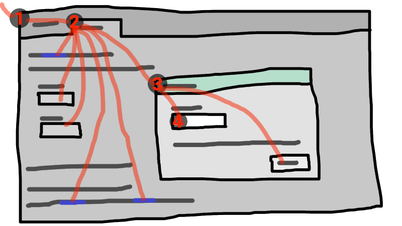
If the widget with focus in this example was the text field in the dialog box, then key
input would be channeled from the graphical system to ① the Web browser, then to ②
the tab, then to ③ the dialog, and finally to ④ the text field.
Keyboard events are always targetted at this focused element.
Data model
The term focusable area is used to refer to regions of the interface that can become
the target of keyboard input. Focusable areas can be elements, parts of elements, or other regions
managed by the user agent.
Each focusable area has a DOM anchor, which is a Node object
that represents the position of the focusable area in the DOM. (When the focusable
area is itself a Node, it is its own DOM anchor.) The DOM anchor is
used in some APIs as a substitute for the focusable area when there is no other DOM object
to represent the focusable area.
The following table describes what objects can be focusable
areas. The cells in the left column describe objects that can be focusable areas; the cells in the right column describe the DOM
anchors for those elements. (The cells that span both columns are non-normative examples.)
| Focusable area
| DOM anchor
|
|---|
| Examples
|
|---|
|
The element itself.
|
|
iframe, <input
type=text>, sometimes <a href=""> (depending on platform
conventions).
|
The img element.
|
In the following example, the area element creates two shapes, one on each
image. The DOM anchor of the first shape is the first img element, and the
DOM anchor of the second shape is the second img element.
<map id=wallmap><area alt="Enter Door" coords="10,10,100,200" href="door.html"></map>
...
<img src="images/innerwall.jpeg" alt="There is a white wall here, with a door." usemap="#wallmap">
...
<img src="images/outerwall.jpeg" alt="There is a red wall here, with a door." usemap="#wallmap">
|
|
The element for which the focusable area is a subwidget.
|
|
The controls in the user
interface that is exposed to the user for a video element, the up and down
buttons in a spin-control version of <input
type=number>, the two range control widgets in a <input type=range multiple>, the part of a
details element's rendering that enabled the element to be opened or closed using
keyboard input.
|
|
The element for which the box that the scrollable region scrolls was created.
|
|
The CSS 'overflow' property's 'scroll' value typically creates a scrollable
region.
|
The Document for which the viewport was created.
|
|
The contents of an iframe.
|
|
The element.
|
|
A user agent could make all list item bullets focusable, so that a user can
more easily navigate lists.
Similarly, a user agent could make all elements with title attributes focusable, so that their advisory information can
be accessed.
|
A browsing context container (e.g. an
iframe) is a focusable area, but key events routed to a browsing context
container get immediately routed to the nested browsing context's active
document. Similarly, in sequential focus navigation a browsing context
container essentially acts merely as a placeholder for its nested browsing
context's active document.
Each focusable area belongs to a control group. Each control group has
an owner. Control group
owners are control group owner objects. The
following are control group owner objects:
Each control group owner object owns one control group (though that
group might be empty).
If the DOM anchor of a focusable area is a control group owner
object, then that focusable area belongs to that control group owner
object's control group. Otherwise, the focusable area belongs to its
DOM anchor's nearest ancestor control group owner object.
An element is expressly inert if it is
inert but it is not a control group owner object and its nearest
ancestor control group owner object is not inert.
One focusable area in each non-empty control group is designated the
focused area of the control group. Which control is so designated changes over time,
based on algorithms in this specification. If a control group is empty, it has no focused area.
Each control group owner object can also act as the manager of a dialog group.
Each dialog element that has an open
attribute specified and that is being rendered (i.e. that is a control group
owner object) and is not expressly inert
belongs to the dialog group whose manager is
the dialog element's nearest ancestor control group owner object.
A dialog is expressly inert if it is
inert but its nearest ancestor control group owner object is not.
If no dialog element has a particular control group owner object as
its nearest ancestor control group owner object, then that control group owner
object has no dialog group.
Each dialog group can have a dialog designated as the focused
dialog of the dialog group. Which dialog is so designated changes over time,
based on algorithms in this specification.
Focusable areas in control groups
are ordered relative to the tree order of their DOM
anchors. Focusable areas with the same DOM anchor in a
control group are ordered relative to their CSS box's relative positions in a pre-order,
depth-first traversal of the box tree. [[!CSS]]
Elements in dialog groups are ordered in tree
order.
The currently focused area of a top-level browsing context at any particular time is
the focusable area or dialog returned by this algorithm:
Let candidate be the Document of the top-level
browsing context.
-
If candidate has a dialog group with a designated
focused dialog of the dialog group, then let candidate be the
designated focused dialog of the dialog group, and redo this step.
Otherwise, if candidate has a non-empty control group, and the
designated focused area of the control group is a browsing context
container, then let candidate be the active document of
that browsing context container's nested browsing context, and redo
this step.
Otherwise, if candidate has a non-empty control group, let
candidate be the designated focused area of the control
group.
Return candidate.
An element that is the DOM anchor of a focusable area is said to gain focus when that focusable area becomes the currently
focused area of a top-level browsing context. When an element is the DOM anchor of a
focusable area of the currently focused area of a top-level browsing context,
it is focused.
The focus chain of a focusable area or control group owner
object subject is the ordered list constructed as follows:
Let current object be subject.
Let output be an empty list.
Loop: Append current object to output.
-
If current object is an area element's shape, append
that area element to output.
Otherwise, if current object is a focusable area whose DOM
anchor is an element that is not current object itself, append that
DOM anchor element to output.
-
If current object is a dialog object in a dialog group,
let current object be that dialog group's manager, and return to the step labeled loop.
Otherwise, if current object is a focusable area, let current
object be that focusable area's control group's owner, and return to the step labeled loop.
Otherwise, if current object is a Document in a nested browsing
context, let current object be its browsing context container,
and return to the step labeled loop.
-
Return output.
The chain starts with subject and (if subject is or can be the currently focused area of a top-level browsing
context) continues up the focus hierarchy up to the Document of the
top-level browsing context.
The tabindex content attribute allows authors to
indicate that an element is supposed to be focusable, and
whether it is supposed to be reachable using sequential focus navigation and, if so,
what is to be the relative order of the element for the purposes of sequential focus navigation.
The name "tab index" comes from the common use of the "tab" key to navigate through the focusable
elements. The term "tabbing" refers to moving forward through the focusable elements that can be
reached using sequential focus navigation.
When the attribute is omitted, the user agent applies defaults. (There is no way to make an
element that is being rendered be not focusable at all without disabling it or making it inert.)
The tabindex attribute, if specified, must have a value
that is a valid integer. Positive numbers specify the relative position of the
element's focusable areas in the sequential focus
navigation order, and negative numbers indicate that the control is to be unreachable by
sequential focus navigation.
Each element can have a tabindex focus flag set, as defined
below. This flag is a factor that contributes towards determining whether an element is a
focusable area, as described in the previous section.
If the tabindex attribute is specified on an element, it
must be parsed using the rules for parsing integers. The attribute's values, or lack
thereof, must be interpreted as follows:
- If the attribute is omitted or parsing the value returns an error
-
The user agent should follow platform conventions to determine if the element's
tabindex focus flag is set and, if so, whether the element and any focusable areas that have the element as their DOM anchor can
be reached using sequential focus navigation, and if so, what their relative
position in the sequential focus navigation order is to be.
Modulo platform conventions, it is suggested that for the following elements, the
tabindex focus flag be set:
One valid reason to ignore the platform conventions and always allow an element
to be focused (by setting its tabindex focus flag) would be if the user's only
mechanism for activating an element is through a keyboard action that triggers the focused
element.
- If the value is a negative integer
-
The user agent must set the element's tabindex focus flag, but should omit the
element from the sequential focus navigation order.
One valid reason to ignore the requirement that sequential focus navigation not
allow the author to lead to the element would be if the user's only mechanism for moving the
focus is sequential focus navigation. For instance, a keyboard-only user would be unable to
click on a text field with a negative tabindex, so that
user's user agent would be well justified in allowing the user to tab to the control
regardless.
- If the value is a zero
-
The user agent must set the element's tabindex focus flag, should allow the
element and any focusable areas that have the element as their
DOM anchor to be reached using sequential focus navigation, following
platform conventions to determine the element's relative position in the sequential focus
navigation order.
- If the value is greater than zero
-
The user agent must set the element's tabindex focus flag, should allow the
element and any focusable areas that have the element as their
DOM anchor to be reached using sequential focus navigation, and should place the element
— referenced as candidate below — and the aforementioned focusable areas in the sequential focus navigation
order so that, relative to other focusable areas in the
sequential focus navigation order, they are:
An element that has its tabindex focus flag set but does not otherwise have an
activation behaviour defined has an activation behaviour that does
nothing.
This means that an element that is only focusable because of its tabindex attribute will fire a click event in response to a non-mouse activation (e.g. hitting the
"enter" key while the element is focused).
An element with the tabindex attribute specified is
interactive content.
The tabIndex IDL attribute must
reflect the value of the tabindex content
attribute. Its default value is 0 for elements that are focusable and −1 for elements that
are not focusable.
Processing model
The focusing steps for an object new focus target that is
either a focusable area, or an element that is not a focusable area, or a
browsing context, are as follows. They can optionally be run with a fallback target.
-
If new focus target is neither a dialog element that has an
open attribute specified and that is being
rendered (i.e. that is a control group owner object), nor a focusable
area, then run the first matching set of steps from the following list:
- If new focus target is an
area element with one or more
shapes that are focusable areas -
Let new focus target be the shape corresponding to the first
img element in tree order that uses the image map to which the area
element belongs.
- If new focus target is an element with one or more scrollable regions
that are focusable areas
-
Let new focus target be the element's first scrollable region,
according to a pre-order, depth-first traversal of the box tree. [[!CSS]]
- If new focus target is the root element of its
Document -
Let new focus target be the Document's viewport.
- If new focus target is a browsing context
-
Let new focus target be the browsing context's
active document.
- If new focus target is a browsing context container
-
Let new focus target be the browsing context container's nested browsing context's
active document.
- Otherwise
-
If no fallback target was specified, abort the focusing steps.
Otherwise, let new focus target be the fallback target.
-
If new focus target is a control group owner object that is
not a focusable area, but does have a dialog group, and that dialog group
has a designated focused dialog, then
let new focus target be the focused dialog of the dialog
group, and redo this step.
Otherwise, if new focus target is a control group owner
object that is not a focusable area, and its control group is not empty,
then designate new focus target as the focused area of the control
group, and redo this step.
Otherwise, if new focus target is a browsing context
container, then let new focus target be the nested browsing
context's active document, and redo this step.
A dialog element can be both a control group owner
object and a focusable area, if it has both an open attribute specified and a tabindex attribute specified and is being
rendered.
If new focus target is a focusable area and its DOM
anchor is inert, then abort these steps.
If new focus target is the currently focused area of a
top-level browsing context, then abort these steps.
Let old chain be the focus chain of the currently focused area of the
top-level browsing context in which new focus target finds
itself.
Let new chain be the focus chain of new
focus target.
Run the focus update steps with old chain, new chain, and new focus target respectively.
User agents must immediately run the focusing steps for a focusable area,
dialog, or browsing context candidate whenever the
user attempts to move the focus to candidate.
The unfocusing steps for an object old focus target that is
either a focusable area or an element that is not a focusable area are as
follows:
If old focus target is inert, then abort these
steps.
-
If old focus target is an area element and one of its shapes is the
currently focused area of a top-level browsing context, or, if old focus
target is an element with one or more scrollable regions, and one of them is the
currently focused area of a top-level browsing context, then let old focus
target be that currently focused area of a top-level browsing context.
Let old chain be the focus chain of the currently
focused area of a top-level browsing context.
If old focus target is not one of the entries in old
chain, then abort these steps.
-
If old focus target is a dialog in a dialog group, and
the dialog group manager has a non-empty control group, then let
new focus target be the designated focused area of that focus group.
Otherwise, if old focus target is a focusable area, then let new
focus target be the first focusable area of its control group
(if the control group owner is a Document, this will always be a
viewport).
Otherwise, let new focus target be null.
If new focus target is not null, then run the focusing
steps for new focus target.
When the currently focused area of a top-level browsing context is somehow
unfocused without another element being explicitly focused in its stead, the user agent must
immediately run the unfocusing steps for that object.
The unfocusing steps do not always result in the focus changing, even
when applied to the currently focused area of a top-level browsing context. For
example, if the currently focused area of a top-level browsing context is a viewport,
then it will usually keep its focus regardless until another focusable area is explicitly
focused with the focusing steps.
When a focusable area is added to an empty control group, it must be designated
the focused area of the control group.
When a dialog group is formed, if the dialog group manager has an empty
control group, the first non-inert dialog in the dialog
group, if any, or else the first dialog in the dialog group regardless of
inertness, must be designated the focused dialog of the dialog
group.
Focus fixup rule one: When the designated focused area of a control group is removed from that control group in
some way (e.g. it stops being a focusable area, it is removed from the DOM, it
becomes expressly inert, etc), and the control
group is still not empty: designate the first non-inert focused area in that control group to be the new
focused area of the control group, if any; if they are all inert, then
designate the first focused area in that
control group to be the new focused area of the control group regardless
of inertness. If such a removal instead results in the control
group being empty, then there is simply no longer a focused area of the control
group.
For example, this might happen because an element is removed from its
Document, or has a hidden attribute added. It might
also happen to an input element when the element gets disabled.
Focus fixup rule two: When a dialog group has no designed focused
dialog of the dialog group, and its dialog group manager's control
group changes from being non-empty to being empty, the first non-inert
dialog in the dialog group, if any, or else the first dialog in
the dialog group regardless of inertness, must be designated
the focused dialog of the dialog group.
Focus fixup rule three: When the designated focused dialog of a dialog group is removed from that dialog group in
some way (e.g. it stops being rendered, it loses its open attribute, it becomes expressly inert, etc), and there is still a dialog group (because the
dialog in question was not the last dialog in that dialog group):
if the dialog group's manager's control
group is non-empty, let there be no designated focused dialog of the dialog group
any more; otherwise (in the case that the control group is empty), designate the first
non-inert dialog in the dialog group to be the focused
dialog of the dialog group, or, if they are all inert, designate the first
dialog in the dialog group to be the focused dialog of the dialog
group regardless of inertness.
When the currently focused area of a top-level browsing context was a focusable
area but stops being a focusable area, or when it was a dialog in a
dialog group and stops being part of that dialog group, or when it
starts being inert, the user agent must run the following steps:
Let old focus target be whatever the currently focused area of the top-level browsing
context was immediately before this algorithm became applicable (e.g. before the element
was disabled, or the dialog was closed, or whatever caused this algorithm to run).
Let old chain be the focus chain of the currently focused area of the
top-level browsing context at the same time.
Make sure that the changes implied by the focus fixup rules one, two, and three above are applied.
Let new focus target be the currently focused area of a
top-level browsing context.
If old focus target and new focus target are the
same, abort these steps.
Let new chain be the focus chain of new
focus target.
Run the focus update steps with old chain, new chain, and new focus target respectively.
The focus update steps, given an old chain, a new chain, and a new focus target respectively, are as
follows:
Unset the sequential focus navigation starting point.
If the last entry in old chain and the last entry in new chain are the same, pop the last entry from old chain
and the last entry from new chain and redo this step.
-
For each entry entry in old chain, in order, run
these substeps:
If entry is an input
element, and the change event applies to the element, and the element does not have a
defined activation behaviour, and the user has changed the element's value or its list of selected files while the control was focused
without committing that change, then fire a simple event that bubbles named change at the element.
-
If entry is an element, let blur event target be
entry.
If entry is a Document object, let blur
event target be that Document object's Window object.
Otherwise, let blur event target be null.
If entry is the last entry in old chain, and
entry is an Element, and the last entry in new
chain is also an Element, then let related blur target
be the last entry in new chain. Otherwise, let related blur
target be null.
-
If blur event target is not null, fire a focus event
named blur at blur event target, with
related blur target as the related target.
In some cases, e.g. if entry is an area
element's shape, a scrollable region, or a viewport, no event is fired.
Apply any relevant platform-specific conventions for focusing new focus
target. (For example, some platforms select the contents of a text field when that field is
focused.)
-
For each entry entry in new chain, in reverse
order, run these substeps:
If entry is a dialog element: Let entry be the designated focused dialog of its dialog group.
-
If entry is a focusable area: Designate entry as the focused area of the control group. If its control
group's owner is also a dialog group
manager, then let there be no designated focused dialog in that dialog group.
It is possible for entry to be both a dialog
element and a focusable area, in which case it is its own control group
owner.
-
If entry is an element, let focus event target be
entry.
If entry is a Document object, let focus
event target be that Document object's Window object.
Otherwise, let focus event target be null.
If entry is the last entry in new chain, and
entry is an Element, and the last entry in old
chain is also an Element, then let related focus target
be the last entry in old chain. Otherwise, let related
focus target be null.
-
If focus event target is not null, fire a focus event
named focus at focus event target, with
related focus target as the related target.
In some cases, e.g. if entry is an area
element's shape, a scrollable region, or a viewport, no event is fired.
When a user agent is required to fire a focus event named e at
an element t and with a given related target r, the user
agent must create a trusted FocusEvent
object, initialise it to have the given name e, to not bubble, to not be
cancelable, and to have the relatedTarget
attribute initialised to r, the view attribute initialised to the Window object of the Document object of t, and the detail attribute initialised to 0, and must then dispatch the newly created FocusEvent object
at the specified target element t.
When a key event is to be routed in a top-level browsing context, the user agent
must run the following steps:
Let target area be the currently focused area of the top-level browsing
context.
If target area is a focusable area, let target
node be target area's DOM anchor. Otherwise, target area is a dialog; let target node be
target area.
-
If target node is a Document that has a body element, then let target node be the body
element of that Document.
Otherwise, if target node is a Document that has a
root element, then let target node be the root
element of that Document.
-
If target node is not inert, fire the event at target node.
It is possible for the currently focused area of a top-level browsing
context to be inert, for example if a modal dialog is shown, and then that dialog
element is made inert. It is likely to be the result of a logic error in the
application, though.
If the event was not canceled, then let target area handle the key
event. This might include running synthetic
click activation steps for target node.
Sequential focus navigation
Each control group has a sequential focus navigation order, which orders some
or all of the focusable areas in the control group
relative to each other. The order in the sequential focus navigation order does not
have to be related to the order in the control group itself. If a focusable area is
omitted from the sequential focus navigation order of its control group, then
it is unreachable via sequential focus navigation.
There can also be a sequential focus navigation starting point. It is initially
unset. The user agent may set it when the user indicates that it should be moved.
For example, the user agent could set it to the position of the user's click if
the user clicks on the document contents.
When the user requests that focus move from the currently focused area of a top-level
browsing context to the next or previous focusable area (e.g. as the default action
of pressing the tab key), or when the user requests that focus sequentially move to a
top-level browsing context in the first place (e.g. from the browser's location bar),
the user agent must use the following algorithm:
Let starting point be the currently focused area of a top-level
browsing context, if the user requested to move focus sequentially from there, or else the
top-level browsing context itself, if the user instead requested to move focus from
outside the top-level browsing context.
If there is a sequential focus navigation starting point defined and it is
inside starting point, then let starting point be the sequential
focus navigation starting point instead.
-
Let direction be forward if the user requested the next
control, and backward if the user requested the previous control.
Typically, pressing tab requests the next control, and pressing
shift+tab requests the previous control.
-
Loop: Let selection mechanism be sequential if the starting
point is a browsing context or if starting point is in its
control group's sequential focus navigation order.
Otherwise, starting point is not in its control group's
sequential focus navigation order; let selection mechanism be
DOM.
Let candidate be the result of running the sequential navigation search
algorithm with starting point, direction, and selection
mechanism as the arguments.
If candidate is not null, then run the focusing steps for
candidate and abort these steps.
Otherwise, unset the sequential focus navigation starting point.
-
If starting point is the top-level browsing context, or a
focusable area in the top-level browsing context, the user agent
should transfer focus to its own controls appropriately (if any), honouring
direction, and then abort these steps.
For example, if direction is backward, then the last
focusable control before the browser's rendering area would be the control to focus.
If the user agent has no focusable controls — a kiosk-mode browser, for instance
—
then the user agent may instead restart these steps with the starting point being the
top-level browsing context itself.
Otherwise, starting point is a focusable area in a
nested browsing context. Let starting point be that
nested browsing context's browsing context container, and return to the
step labeled loop.
The sequential navigation search algorithm consists of the following steps. This
algorithm takes three arguments: starting point, direction,
and selection mechanism.
-
Pick the appropriate cell from the following table, and follow the instructions in that
cell.
The appropriate cell is the one that is from the column whose header describes direction and from the first row whose header describes starting point and selection mechanism.
A suitable sequentially focusable area is a focusable area whose DOM
anchor is not inert and that is in its control group's sequential
focus navigation order.
The primary control group of a control group owner object X is the control group of X if X has no dialog group or if its dialog group has no
designated focused dialog of the dialog group, otherwise, it is the primary
control group of X's dialog group's designated
focused dialog of the dialog group.
The home control group is the control group to which starting point belongs.
The home sequential focus navigation order is the sequential focus
navigation order to which starting point belongs.
The home sequential focus navigation order is the home
control group's sequential focus navigation order, but is only used when the
starting point is in that sequential focus navigation order
(when it's not, selection mechanism will be DOM).
-
If candidate is a browsing context container, then let new candidate be the result of running the sequential navigation search
algorithm with candidate's nested browsing context as
the first argument, direction as the second, and sequential
as the third.
If new candidate is null, then let starting point
be candidate, and return to the top of this algorithm. Otherwise, let candidate be new candidate.
Return candidate.
Focus management APIs
- document .
activeElement -
Returns the deepest element in the document through which or to which key events are being
routed. This is, roughly speaking, the focused element in the document.
For the purposes of this API, when a child browsing context is focused, its
browsing context container is focused in the
parent browsing context. For example, if the user moves the focus to a text field
in an iframe, the iframe is the element returned by the activeElement API in the iframe's
node document.
- document .
hasFocus() -
Returns true if key events are being routed through or to the document; otherwise, returns
false. Roughly speaking, this corresponds to the document, or a documented nested inside this
one, being focused.
- window .
focus() -
Moves the focus to the window's browsing context, if any.
- element .
focus() -
Moves the focus to the element.
If the element is a browsing context container, moves the focus to the nested browsing context instead.
- element .
blur() -
Moves the focus to the viewport. Use of this method is discouraged; if you want to focus the
viewport, call the focus() method on the Document's root element.
Do not use this method to hide the focus ring. Do not use any
other method that hides the focus ring from keyboard users, in
particular do not use a CSS rule to override the 'outline'
property. Removal of the focus ring leads to serious accessibility
issues for users who navigate and interact with interactive
content using the keyboard.
The activeElement attribute on
Document objects must return the value returned by the following steps:
Let candidate be the Document on which the method was
invoked.
If candidate has a dialog group with a designated
focused dialog of the dialog group, then let candidate be the
designated focused dialog of the dialog group, and redo this step.
If candidate has a non-empty control group, let candidate be the designated focused area of the control
group.
If candidate is a focusable area, let candidate be candidate's DOM anchor.
-
If candidate is a Document that has a body element, then let candidate be the body
element of that Document.
Otherwise, if candidate is a Document that has a root
element, then let candidate be the root element of that
Document.
Otherwise, if candidate is a Document, then let candidate be null.
Return candidate.
The hasFocus() method on
Document objects must return the value returned by the following steps:
Let target be the Document on which the method was
invoked.
Let candidate be the Document of the top-level
browsing context.
If candidate is target, return true and abort
these steps.
-
If candidate has a dialog group with a designated focused
dialog of the dialog group, then let candidate be the designated
focused dialog of the dialog group, and redo this step.
Otherwise, if candidate has a non-empty control group, and the
designated focused area of the control group is a browsing context
container, and the active document of that browsing context
container's nested browsing context is target, then
return true and abort these steps.
Otherwise, if candidate has a non-empty control group, and the
designated focused area of the control group is a browsing context
container, then let candidate be the active document of
that browsing context container's nested browsing context, and redo
this step.
Otherwise, return false and abort these steps.
The focus() method on the Window
object, when invoked, must run the focusing steps with the Window
object's browsing context. Additionally, if this browsing context is a
top-level browsing context, user agents are encouraged to trigger some sort of
notification to indicate to the user that the page is attempting to gain focus.
The blur() method on the Window
object, when invoked, provides a hint to the user agent that the script believes the user probably
is not currently interested in the contents of the browsing context of the
Window object on which the method was invoked, but that the contents might become
interesting again in the future.
User agents are encouraged to ignore calls to this blur()
method entirely.
Historically, the focus() and blur() methods actually affected the system-level focus of the
system widget (e.g. tab or window) that contained the browsing context, but hostile
sites widely abuse this behaviour to the user's detriment.
The focus() method on elements, when invoked, must
run the following algorithm:
If the element is marked as locked for focus, then abort these steps.
Mark the element as locked for focus.
Run the focusing steps for the element.
Unmark the element as locked for focus.
The blur() method, when invoked, should run the
unfocusing steps for the element on which the method was called. User agents may
selectively or uniformly ignore calls to this method for usability reasons.
For example, if the blur() method is unwisely
being used to remove the focus ring for aesthetics reasons, the page would become unusable by
keyboard users. Ignoring calls to this method would thus allow keyboard users to interact with the
page.
Assigning keyboard shortcuts
Introduction
This section is non-normative.
Each element that can be activated or focused can be assigned a single key combination to
activate it, using the accesskey attribute.
The exact shortcut is determined by the user agent, based on information about the user's
keyboard, what keyboard shortcuts already exist on the platform, and what other shortcuts have
been specified on the page, using the information provided in the accesskey attribute as a guide.
In order to ensure that a relevant keyboard shortcut is available on a wide variety of input
devices, the author can provide a number of alternatives in the accesskey attribute.
Each alternative consists of a single character, such as a letter or digit.
User agents can provide users with a list of the keyboard shortcuts, but authors are encouraged
to do so also. The accessKeyLabel IDL attribute returns a
string representing the actual key combination assigned by the user agent.
In this example, an author has provided a button that can be invoked using a shortcut key. To
support full keyboards, the author has provided "C" as a possible key. To support devices
equipped only with numeric keypads, the author has provided "1" as another possibly key.
<input type=button value=Collect onclick="collect()"
       accesskey="C 1" id=c>
To tell the user what the shortcut key is, the author has this script here opted to explicitly
add the key combination to the button's label:
function addShortcutKeyLabel(button) {
  if (button.accessKeyLabel != '')
    button.value += ' (' + button.accessKeyLabel + ')';
}
addShortcutKeyLabel(document.getElementById('c'));
Browsers on different platforms will show different labels, even for the same key combination,
based on the convention prevalent on that platform. For example, if the key combination is the
Control key, the Shift key, and the letter C, a Windows browser might display
"Ctrl+Shift+C", whereas a Mac browser might display "^⇧C", while
an Emacs browser might just display "C-C". Similarly, if the key combination is the
Alt key and the Escape key, Windows might use "Alt+Esc", Mac might use
"⌥⎋", and an Emacs browser might use "M-ESC" or
"ESC ESC".
In general, therefore, it is unwise to attempt to parse the value returned from the accessKeyLabel IDL attribute.
The accesskey attribute
All HTML elements may have the accesskey
content attribute set. The accesskey attribute's value is used
by the user agent as a guide for creating a keyboard shortcut that activates or focuses the
element.
If specified, the value must be an ordered set of unique space-separated tokens
that are case-sensitive, each of which must be exactly one Unicode code point in
length.
In the following example, a variety of links are given with access keys so that keyboard users
familiar with the site can more quickly navigate to the relevant pages:
<nav>
 <p>
  <a title="Consortium Activities" accesskey="A" href="/Consortium/activities">Activities</a> |
  <a title="Technical Reports and Recommendations" accesskey="T" href="/TR/">Technical Reports</a> |
  <a title="Alphabetical Site Index" accesskey="S" href="/Consortium/siteindex">Site Index</a> |
  <a title="About This Site" accesskey="B" href="/Consortium/">About Consortium</a> |
  <a title="Contact Consortium" accesskey="C" href="/Consortium/contact">Contact</a>
 </p>
</nav>
In the following example, the search field is given two possible access keys, "s" and "0" (in
that order). A user agent on a device with a full keyboard might pick Ctrl+Alt+S as the shortcut key,
while a user agent on a small device with just a numeric keypad might pick just the plain
unadorned key 0:
<form action="/search">
 <label>Search: <input type="search" name="q" accesskey="s 0"></label>
 <input type="submit">
</form>
In the following example, a button has possible access keys described. A script then tries to
update the button's label to advertise the key combination the user agent selected.
<input type=submit accesskey="N @ 1" value="Compose">
...
<script>
 function labelButton(button) {
   if (button.accessKeyLabel)
     button.value += ' (' + button.accessKeyLabel + ')';
 }
 var inputs = document.getElementsByTagName('input');
 for (var i = 0; i < inputs.length; i += 1) {
   if (inputs[i].type == "submit")
     labelButton(inputs[i]);
 }
</script>
On one user agent, the button's label might become "Compose (⌘N)". On
another, it might become "Compose (Alt+⇧+1)". If the user agent doesn't
assign a key, it will be just "Compose". The exact string depends on what the
assigned access key is, and on how the user agent represents that key
combination.
Processing model
An element's assigned access key is a key combination derived from the element's
accesskey content attribute. Initially, an element must not
have an assigned access key.
Whenever an element's accesskey attribute is set, changed,
or removed, the user agent must update the element's assigned access key by running
the following steps:
If the element has no accesskey attribute, then skip
to the fallback step below.
Otherwise, split the attribute's value on
spaces, and let keys be the resulting tokens.
-
For each value in keys in turn, in the order the tokens appeared in the
attribute's value, run the following substeps:
If the value is not a string exactly one Unicode code point in length, then skip the
remainder of these steps for this value.
If the value does not correspond to a key on the system's keyboard, then skip the
remainder of these steps for this value.
If the user agent can find a mix of zero or more modifier keys that, combined with the
key that corresponds to the value given in the attribute, can be used as the access key, then
the user agent may assign that combination of keys as the element's assigned access
key and abort these steps.

Fallback: Optionally, the user agent may assign a key combination of its choosing
as the element's assigned access key and then abort these steps.
If this step is reached, the element has no assigned access key.
Once a user agent has selected and assigned an access key for an element, the user agent should
not change the element's assigned access key unless the accesskey content attribute is changed or the element is moved to
another Document.
When the user presses the key combination corresponding to the assigned access key
for an element, if the element defines a command, the
command's Hidden State facet is false (visible),
the command's Disabled State facet is also false
(enabled), the element is in a Document that has an associated
browsing context, and neither the element nor any of its ancestors has a hidden attribute specified, then the user agent must trigger the Action of the command.
User agents might expose elements that have
an accesskey attribute in other ways as well, e.g. in a menu
displayed in response to a specific key combination.
The accessKey IDL attribute must
reflect the accesskey content attribute.
The accessKeyLabel IDL attribute must return
a string that represents the element's assigned access key, if any. If the element
does not have one, then the IDL attribute must return the empty string.